Gary Holder

Ident Inspiration

This is an example of an Ident that has been modified to fir the genre of the film, the colours of red and black were used to reflact that this film is a thriller/horror. There is also a flickering similar to the Seven title sequence to create an uneasy atmosphere to foreshadow the atmosphere of the film. This ident is also clearly aimed at an older target audience as it is simply the words of the institution.

Lionsgate is an iconic ident and they have been behind countless famous thrillers. However they also produce many non-thriller films so the ident is somewhat ambiguous in terms of genre.The dark, overcast clouds reflect that this film will be be a thriller and the text dominates the screen, creates a sense of power with this institution meaning it will stick in the mind of the audience.

The Universal ident is one seen before many successful films and, similarly to lionsgate creates a sense of the company being very successful and this is perhaps because the ident is on such a large scale.The large,blocky font creates an imposing atmosphere to the ident making the company stick in the audiences minds and be very memorable.


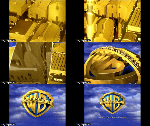
It seems to be a convention for Idents of large companies to be infront of a sky or space background, in order to appear more impressive. Warner Bros. also have adaptations of their ident for different films, for example in the Harry Potter franchise the idents become increasingly darker and threatening as the films become more serious.


